
Good Label Design is Black and White
So much of what I see in consumable products on the selves of our supermarkets is either poorly designed, outdated, or just unremarkable. I have to ask why, when there are so many great designers (like you) out there capable of so much better. I guess it is either budgets are set way too low, or the people making the final decisions aren't designers and are not really qualified to oversee the artwork that is being approved.
In response to my quandary I have redesigned a couple of food product labels (as concepts) for some foods I am fond of, to demonstrate both my ability as a designer and how simple things can be so much more appealing.
The first label redesign is for Urban Meadow's Creamy (or Crunchy) Organic Peanut Butter. I think Urban Meadow has an excellent product with no added sugar. Though there is no call-out to that fact on the current label. Like all natural peanut butters, the oil will separate to the top if left standing. However, when set upside down or stirred well both its consistency and flavor is superior to, say, Trader Joe's Organic peanut butter for an example – But that is only my humble opinion.
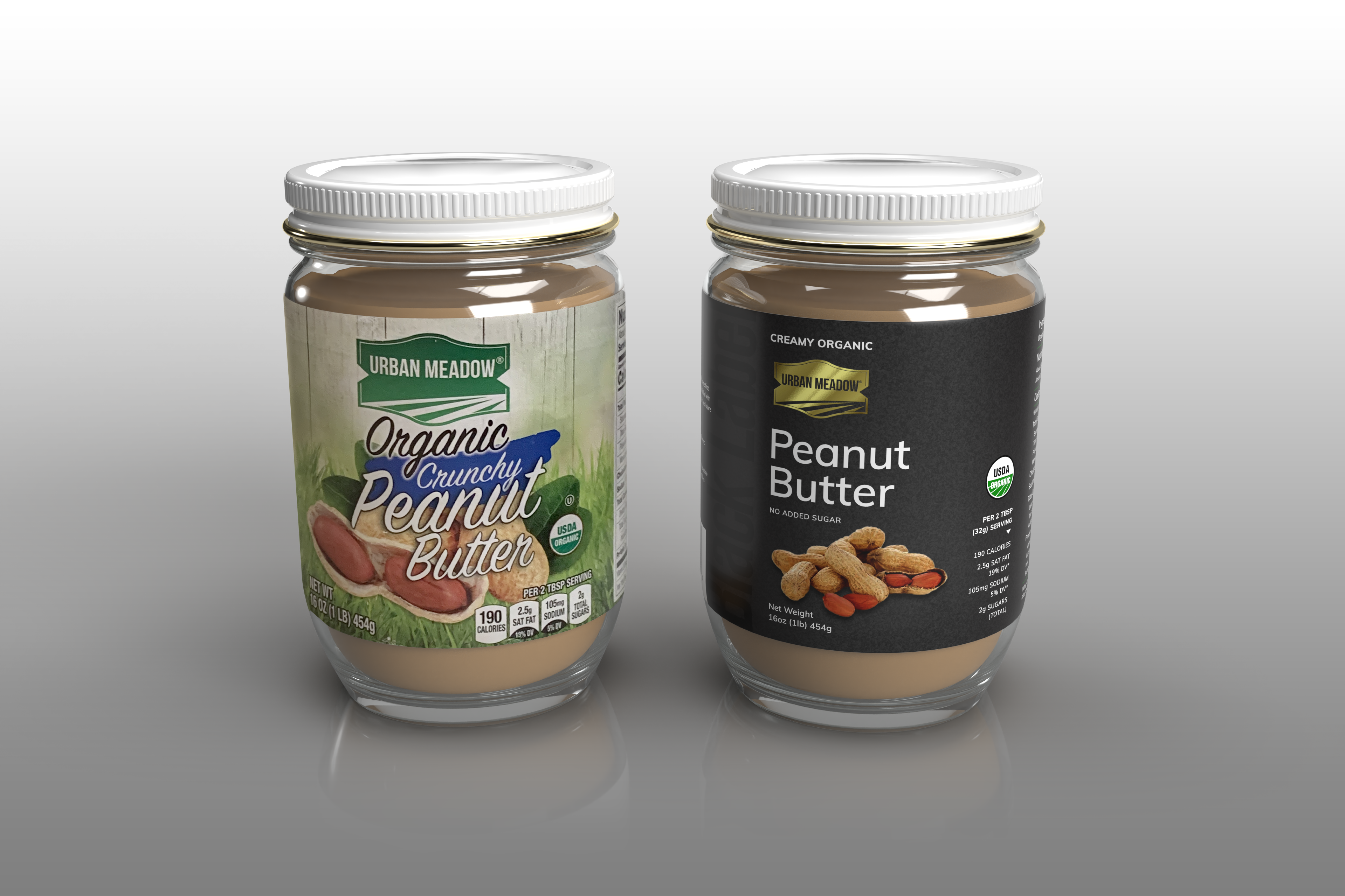
The current label (on the left) is overly cluttered and does not utilize negative area aesthetics. The big downfall is the readability of the typography and the use of overprinting imagery, that in my opinion, is past its use-by date.
My idea of a Black Label product is whimsical and I have adopted a straight forward align-left/align-right format over the usual centered approach. I think the use of gold foil logo could lift it off the shelf amongst similar products.
I don't think my design is anything out-of-the-box as I only spent about 3 hours on it and I started with a preconception for layout and font use – which is something I would not do when contacted for a paid design assignment.
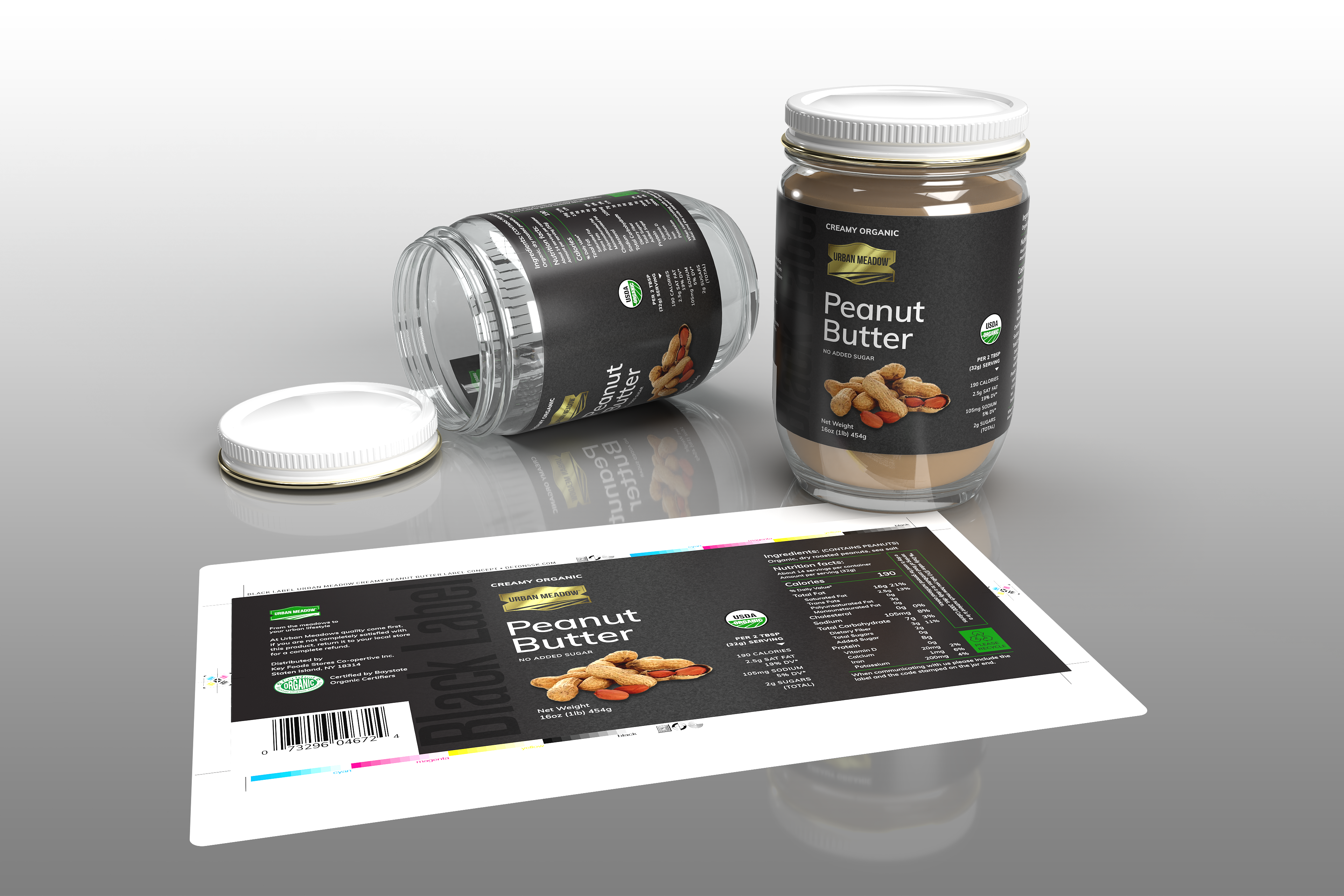
The use of consistent font style and sizing throughout the label improves readability no doubt. Though the label size 180mm X 80mm means the the type size is quite small (5pt) in many places. This can be a reverse-out problem for printers even though the text is kept as a semibold san serif. Hence the background only uses the black plate for the process CMYK lithography.

The second label concept is for Follow Your Heart Avocado Oil Vegenaise. Current label (on the left) is again cluttered and does not utilize negative area aesthetics. Typography is all over the place with different styles and sizes.
Incredulous as it might sound, I've been buying this product for years and was unaware of its brand "Follow Your Heart" until I thought to do this concept art – Which endorses the fact that bigger and bolder doesn't make it more noticeable. It is alway about staging, hence I've also proposed a modernized logo.
Again I only spent a few hours on the design and pretty well stayed with the same align-left/align-right theme and concept structure. As with both labels, the ample black or white space ensures the readability of the text on the label, as too does the font choice.
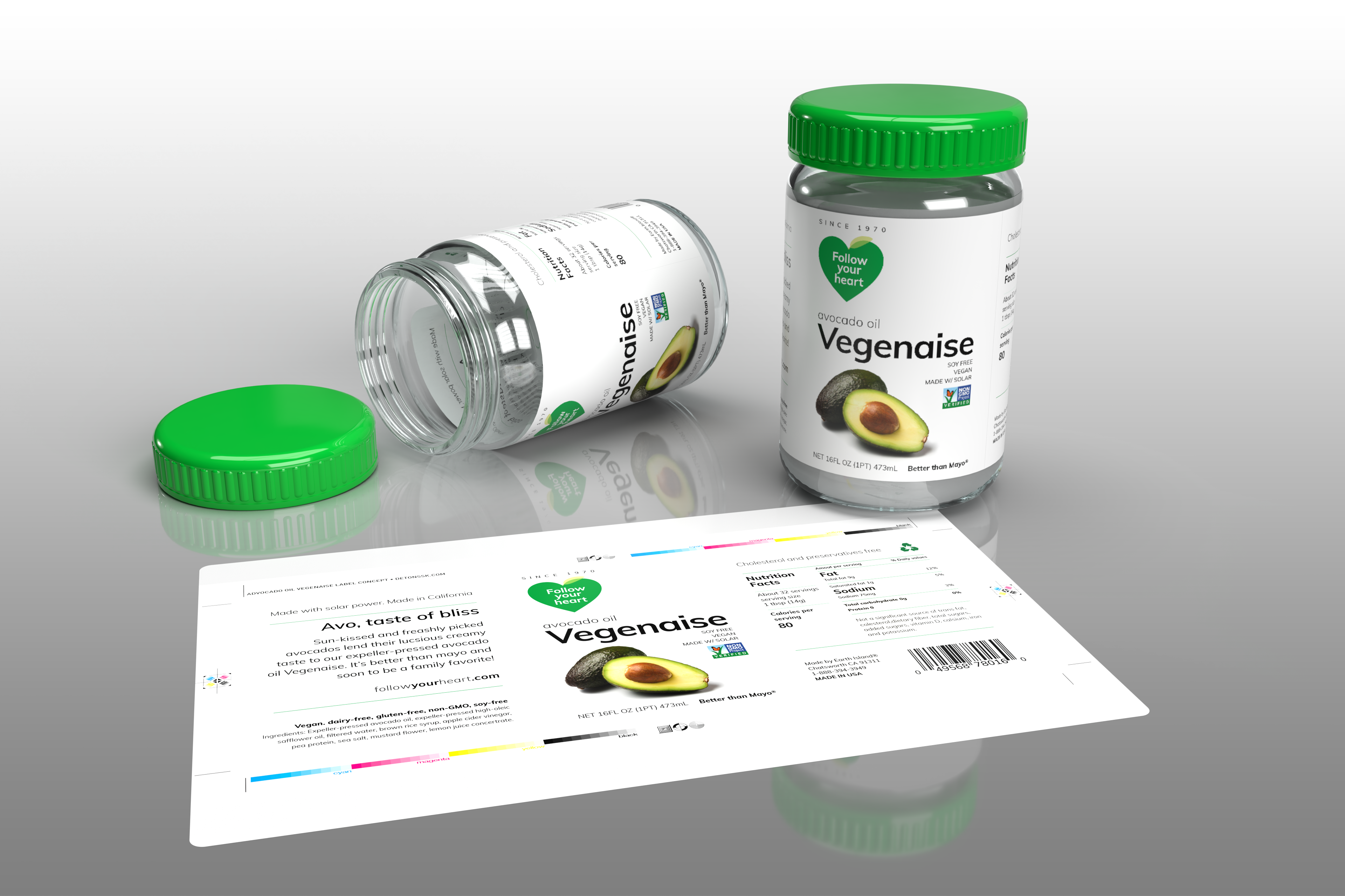
The typeface used is Muli. I find it captures the "Avant Garde" (AG) appeal, with a slightly more friendly aspect. Another thing I'd like to mention is that product labeling today needs very much to consider how it looks, not only on the supermarket selves amongst similar products, but isolated at 150 pixels on shopping websites.
Production notes: The 3D renderings were executed in Adobe Dimensions with models I created in Adobe Illustrator. (Sorry about the gray mayo). I was excited to download After Effects Beta with 3D model object support, But it did not successfully import the revolved object models I had created. There was stepping to the curvatures and the mapping did translate either. Disappointing, as I'd have like to have done a fly-by for this post. I'm sure AE Beta will handle extrusions no problem.